Embarrassing Questions
The decade of the 2000s is almost over; there’s only a bit more than 6 months to go. This decade has witnessed the hottest year on record (2005), the lowest summer arctic ice extent ever observed (2007), and the highest sea level in recorded history (2008, although data for 2009 are not yet available). It has also seen a war against truth and the scientific community, waged by the forces of ignorance and dishonesty who deny that global warming is real, is man-made, and is dangerous.
A few of the assault leaders are scientists (but when they opine on global warming their scientific expertise and objectivity abandon them or is banished); many are capitalists attached to “free markets” as an ideology who see any attempt to mitigate climate change as a threat to the fossil-fuel-based economics which is the source of their obscene wealth; some are politicians, who are probably motivated by the same free-market ideology which, frankly, gives capitalism a bad name.
One such politician is Australian senator Steve Fielding. He recently attempted to embarrass Australian Climate Change Minister Penny Wong by posing three “questions” which were framed by a fellow Aussie denialist, “scientist” Bob Carter. I put “scientist” in quotes because in spite of Carter’s scientific credentials, his statements regarding global warming are so amateurish as to cast doubt on his qualifications to opine on any scientific topic. The word “questions” likewise merits quotes because they really aren’t questions at all; they’re a transparent attempt to suggest what’s false as though it were true in an effort to embarrass global warming science. They’re so patently false that the real embarrassment is for those who pose them.
Let’s look at the very first “question”:
1. Is it the case that CO2 increased by 5 per cent since 1998 whilst global temperature cooled over the same period? If so, why did the temperature not increase; and how can human emissions be to blame for dangerous levels of warming?
Of course Carter chooses to start with 1998; that was the year of the huge el Nino, causing it to be quite a bit hotter than the prevailing trend due to a random, and entirely natural, fluctuation. Carter doesn’t hesitate to use natural fluctuation to his advantage; he has deliberately chosen an extreme maximum as his starting point to give the impression that global temperature has cooled. This is an example of the kind of dishonesty called “cherry-picking.” How sad that someone who purports to be scientific has to resort to this kind of subterfuge.
The pathetic part is that even the subterfuge doesn’t make the “Is it the case” claim true. Using the very HadCRU temperature data referred to by Carter, the average temperature for the 1st half of the period in question (1998 to the present) is 0.4012 deg.C, while the average for the 2nd half of the period in question is 0.4138 deg.C. The 2nd half of the time period in question is still warmer, in spite of the time span starting with an immensely strong el Nino and ending with a la Nina — even with the most favorable (to their case) possible juxtaposition of natural variations, the claim “global temperature cooled” is either wishful thinking or deliberate deception. What it’s NOT is: true.
The HadCRU time series omit the arctic region, the fastest-warming area of the globe; that’s one of the reasons I prefer GISS data, for which the average temperature during the 1st half of “since 1998″ is 0.4588 deg.C while the average for the 2nd half is 0.5300 deg.C. Again, NOT cooler.
Carter also omits to mention any estimate of the uncertainty associated with trend estimates over such a brief span of time. The rather verbose and even more misleading Assessment of Minister Wong’s Written Reply actually contains this ludicrous falsehood:
It is the IPCC who have previously denied the effect of natural variability.
This is as false as it gets, people. The IPCC has never denied the effect of natural variability, in fact the IPCC reports discuss it extensively. The “Assessment” goes on to say
For example, the 2001 Summary for Policymakers claimed, based on computer model simulations, that the climate system has only a limited internal variability. In turn, this claim was, and is, used to underpin the argument that carbon dioxide forcing is the only plausible explanation for the late 20th century warming trend.
For the government to now invoke natural variability as an explanation for the elapsed temperature curve is to destroy the credibility of their previous arguments for carbon dioxide forcing.
Natural variation is limited — too small to explain late 20th century warming — but that doesn’t mean it’s not big enough to explain the natural fluctuations “since 1998.” It’s hard to tell whether Bob Carter is ignorant enough to believe this argument, or he just thinks we’re all a bunch of idiots.
Bob Carter just might be the world’s loudest repeater of the “global warming stopped in 1998″ mantra. But he’s hardly the only one who loves to make pronouncements about trends based on data covering far too short a span of time. In fact the GISS data “since 1998″ show a trend rate of 0.009 +/- 0.016 deg.C/yr; that’s somewhere between actual cooling (at -0.007 deg.C/yr) and warming way-faster-than-anyone-believes-even-me (at 0.025 deg.C/yr). This tells us only two things: 1st, the trend “since 1998″ is totally consistent with the trend since 1975, and 2nd, the time span in question is way too short to give any meaningful information about temperature trends. Bob Carter might know a thing or two about sedimentology, but in statistics he gets an F. Minus.
Why the obsession with trends over short time spans? For some, it’s because they want the most up-to-date estimates possible and they honestly don’t know how meaningless such results are. For Carter and his ilk, it’s because that’s the only way they can possibly hope to confuse people about a trend which, on time scales which are long enough to be statistically meaningful, are blatantly obvious. So they start with the biggest el Nino and end with a la Nina to take maximum opportunistic advantage of natural variation, keep the time span short to take maximum statistical advantage of natural variation, then whine when it’s pointed out that natural variation is at play.
Whine even louder when it’s pointed out that even with a cherry-picked starting point and too short a time span, “global temperature cooled” STILL isn’t true.
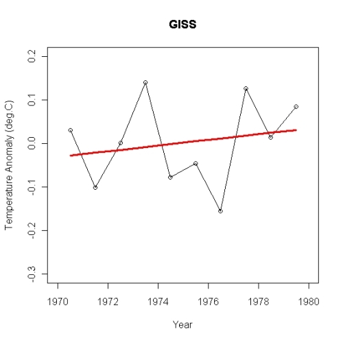
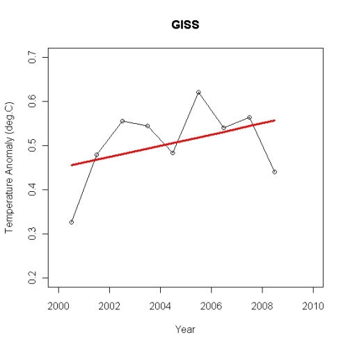
I’ve often posted about the uncertainty in trend estimates, and the inevitability of random noise giving the false impression of cooling on short time scales. Perhaps it’s useful to take a look at what actual global temperature looks like on short time scales. Let’s look at some decades, the 1970s through the 2000s. I’ll plot all decades on the same scale for both axes; here are annual average temperatures from GISS for the 1970s:
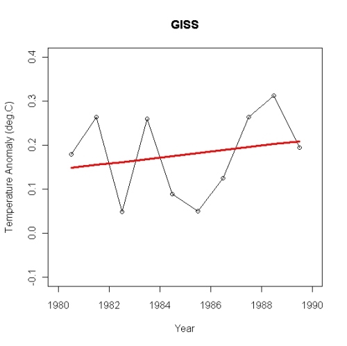
Linear regression gives a positive slope, at 0.0065 +/- 0.0224 deg.C/yr, but the error limits are way too big to draw any meaningful conclusion and the visual impression of the graph doesn’t indicate warming or cooling, just a lot of jiggling around. That’s natural variation for you; a lot of jiggling around which makes trend estimates on short timescales too imprecise to be useful. The 1980s gives a nearly identical impression:
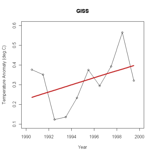
Again the linear regression slope is positive at 0.0067 +/- 0.0219 deg.C/yr, again the uncertainty is much larger than the estimate, and again the visual impression is neither warming nor cooling, just a lot of jiggling. For the 1990s we have:
The untrained eye may get the impression of a meaningful warming trend. But the linear regression trend rate is 0.0179 +/- 0.0276 deg.C/yr, so the error range is still considerably larger than the estimate. From these data, we’d estimate global temperature change as somewhere between rapid cooling (-0.0097 deg.C/yr) and oh-my-god-we’re-all-going-to-fry warming (+0.0455 deg.C/yr). For the 2000s we have:
This time the linear regression trend rate is 0.0126 +/- 0.0218 deg.C/yr, so once again the uncertainty is much larger than the estimate. It is worth noting that of these four decades, the 2000s don’t have the smallest linear regression trend rate, they have the 2nd-largest.
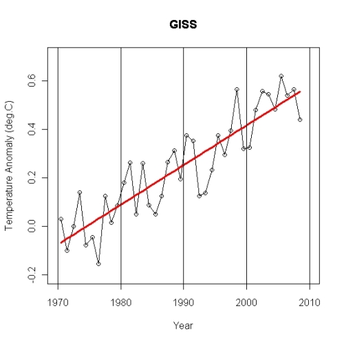
What’s the cure for “too short to tell” time spans? Longer time spans! Here’s the data from 1970 to the present:
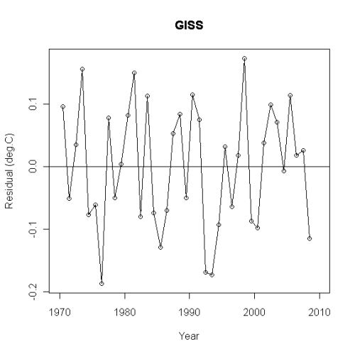
~Clearly a decade is too brief a time span to get a meaningful trend estimate; just as clearly the trend since 1970 is — how shall one say? — obvious. The linear regression trend rate is 0.0164 +/- 0.0028 deg.C/yr. I have good reason to believe that the “turning point” marking the start of recent warming is 1975 rather than 1970, but even with this earlier date the trend is statistically significant. Strongly. And it’s warming, not cooling. We can even graph the residuals from this linear fit:
The residuals certainly don’t give the visual impression that the last decade, or “since 1998,” or any other episode, represents a departure from the overall trend. They don’t support that idea statistically either.
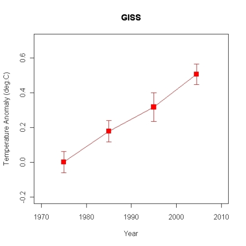
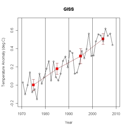
We can reduce the noise level by taking averages over longer time spans, as I’ve often mentioned. Here are 10-year averages since 1970:
Pay attention, Bob Carter: THIS IS WHAT GLOBAL WARMING IS ABOUT. IT’S NOT ABOUT LESS-THAN-A-DECADE NATURAL FLUCTUATION, IT’S ABOUT THE INEXORABLE INCREASE FROM DECADE TO DECADE.
In case you’re interested in how the 10-year averages compare to the 1-year averages, here they are together:
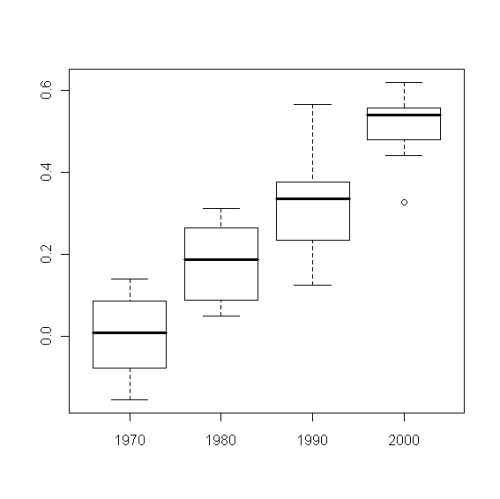
In case you’re interested in both the location and the variation of temperature within each decade, here are “box-and-whiskers plots” for each decade:
The box extends from the 1st quartile (the 25% probability point) to the 3rd quartile (the 75% probability point) with the thick line in the middle indicating the median value (the 50% probability point). The “whiskers” extend to the smallest and largest values which are not potential “outliers.” Outliers are often identified as points which are more than 1.5 times the “interquartile range” below the 1st quartile, or above the 3rd quartile, with the interquartile range being the difference between 1st and 3rd quartiles. The outliers are plotted as small circles. Only the 2000s have a potential outlier; the year 2000 was quite a bit cooler than the rest of the 2000s.
It’s appropriate to end this post with a quote from Timothy Chase in recent reader comments:
… anyone who tries to establish the trend in global average temperature with much less than fifteen years data is — in my view — either particularly ignorant of the science, or what is more likely, some sort of flim-flam artist …
That certainly includes Steve Fielding and Bob Carter. At least Fielding has an excuse; he’s “particularly ignorant of the science.” As for Carter …
http://tamino.wordpress.com/2009/06/26/embarrassing-questions/
 NOAA National Climatic Data Center (NCDC)
 NASA Goddard Institute for Space Studies (GISS)
 Remote Sensing Systems (RSS)
 University of Alabama in Huntsville (UAH)
 NOAA National Climatic Data Center (NCDC)
 NASA Goddard Institute for Space Studies (GISS)
 Remote Sensing Systems (RSS)
 University of Alabama in Huntsville (UAH)


